

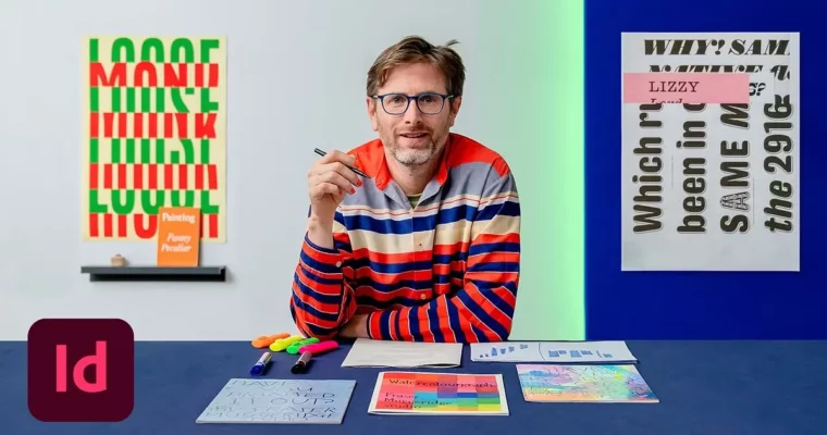
Creative Typesetting for Editorial Projects by Fraser Muggeridge

Actual Duration:2h 46m
Release date:2022, July
Publisher:Domestika
Skill level:Intermediate
Language:English
Exercise files:Yes
Software:Adobe InDesign
Course URL:https://www.domestika.org/en/courses/2429-creative-typesetting-for-editorial-projects
This course is all about the details that make editorial design sing. Fraser Muggeridge, a London-based typographic designer, walks you through his process for turning a dense, complex text into a layout that actually communicates. You’ll learn how to control hierarchy, shape paragraphs, and use typographic marks to inject tone and emotion into your work. It’s practical, hands-on, and focused on the print page.
🎯 What you’ll learn
- Apply practical typographic details to communicate tone and emotion
- Define text hierarchy and structure for complex editorial layouts
- Use Adobe InDesign efficiently for typesetting workflows
- Create professional print-ready mock-ups with attention to detail
✅ Requirements
- Skills: Understanding of graphic design fundamentals
- Tools: Adobe InDesign, access to a printer
📝 Description
Fraser doesn’t just show you pretty layouts. He breaks down the theory of detail in typography and shows you how to use a printer as an actual design tool, not just an output device. You’ll explore innovative ways of typesetting that go beyond the default settings and dig into the math behind grids and paragraph structures.
The course pushes you to think about every element on the page. Word spacing, typographic marks, paragraph shapes — all of it matters. Fraser’s approach is methodical: define the hierarchy, build the grid, then refine the details until the text feels right. By the end, you’ll have a workflow for tackling complex editorial projects with confidence.
🧑🎓 Who this course is for
- Graphic designers looking to move into editorial design
- Designers who want to improve their typographic detail and layout skills
🧑🏫 About the Author
Fraser Muggeridge is a typographic designer and founder of Muggeridge Studio in London. His studio has worked with clients like Metronomy, Hot Chip, Taylor Swift, and Thames and Hudson, helping them communicate messages, values, and ideas through thoughtful typography. His work is rooted in a deep understanding of how type carries meaning beyond the words themselves.
🏁 Final Result
- A redesigned complex text for a printed page, demonstrating your ability to tackle hierarchy, structure, and typographic details in a professional editorial layout.
 Channel