

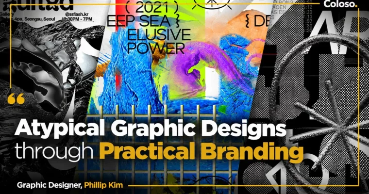
Atypical Graphic Designs through Practical Branding by Phillip Kim
Duration:9Hours 33Minutes
Actual Duration:19h 4m
Release date:2023
Publisher:Coloso
Skill level:Advanced
Language:English
Exercise files:Yes
Software:Adobe Illustrator, Adobe Photoshop, Adobe InDesign
Course URL:https://coloso.global/en/products/graphicdesigner-phillipkim-us
If you keep seeing those weird, cool cafe and bar graphics in Hannam and Seongsu and wonder how they get made, this is that class. Phillip Kim shows you how to build postmodern typography, a solid branding system, and a full client-style project in Adobe Illustrator without losing readability.
🎯 What you’ll learn
- Understand graphic elements from Phillip Kim’s perspective – lines, text, fonts, and basic modeling
- Build an information-rich yet simple typography system that carries a brand message on one page
- Plan strategic branding from research and market positioning to naming and concept development
- Design a clear brand-identity system with colors, graphic motifs, typefaces, photos, and icons
- Create brand applications like stationery, menus, stickers, packaging, signage, and merch
- Design attention-grabbing posters and social media assets and package everything into brand guidelines
✅ Requirements
- Skills: Basic familiarity with graphic design fundamentals, comfortable working with type, layout, and Adobe tools
- Tools: Adobe Illustrator CC 2021, Adobe Photoshop CC 2021, Adobe InDesign CC 2021 (CC 2015 or later usable)
- Hardware: Laptop or desktop capable of running Adobe Creative Cloud smoothly
📝 Description
This isn’t theory-only. You get a hypothetical client — a wine bar in Hannam-dong — and you run the whole job like you were hired to do it. Research, positioning, naming, brand strategy, moodboards with a metaphorical approach, then logo, type, and graphics. You finish with real stuff you can show: menus, stickers, tees, packaging, signage.
Early on, Phillip breaks down how he thinks about type. How to twist a typeface, stack text, mix fonts, and still keep it legible. You will practice custom typography and logo systems step by step, then learn how to turn those experiments into rules — color, motifs, photo style, icons — so the brand looks consistent everywhere.
The second half is all application. Stationery, menu design, merch, posters with strong key visuals, social media assets, and a brand guide. He also talks straight about what makes work commercial vs. just weird for the sake of it. How to keep visual shock, but still deliver information clearly so clients like Nike or Lacoste would actually buy it.
🧑🎓 Who this course is for
- Graphic designers who want to break out of clean, template-style work and build their own typographic voice
- Branding designers and freelancers who want to practice a full process from research to guidelines and merch
- Portfolio builders and students aiming for studio, agency, or fashion / music / F&B clients with edgy tastes
🧑🏫 About the Author
Hi, I’m Phillip Kim, an art director and graphic designer based in New York and Seoul. I work as a designer at Wieden+Kennedy and run an experimental label called Smile Flower. Before that I worked at Wax Studios, Something Special Studios, 2×4, and others.
I’ve done direction and graphics for Nike, Prada, Converse, Descente, Lacoste, SM TOWN, Vans, Hypebeast, and projects like Nike NYC, Nike X LMC, and Circuit Seoul. My postmodern and graffiti-style work I posted online hit at the right time in Korea and got a lot of attention from new brands. In this class I share how I keep that atypical look balanced and usable for real client work.
🏁 Final Result
- A complete hypothetical wine bar branding project with logo and typography system, brand system rules, stationery, menu, stickers, t-shirt, packaging, signage, key visual poster, social media assets, and brand guidelines — ready to add to your portfolio.
📢 Guys, this is a Group Buy campaign, check the GBC forum thread to get access
You can find the course preview in the download section below.
 Channel