Orthotypography for Designers (Spanish, Multisub)
Release date:2022
Skill level:Beginner
Language:Spanish
Exercise files:Not Provided
Course URL:https://www.domestika.org/en/courses/129-orthotypography-for-designers
Learn in great detail the typographical standards for the characters you design with
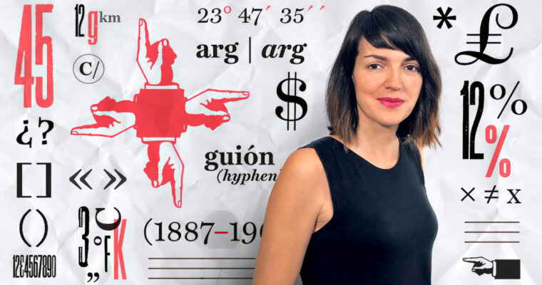
Raquel Marín (Lalolagráfica) is a graphic designer and expert in typography. It is specialized in orthotypography, that is, the set of rules that govern the correct use of typography.
In this Domestika course you will learn the correct application of the signs and symbols found on the keyboard and in the menus of the programs with which you design (quotes, dashes, stripes, brackets, voladitas, acronyms, italics, small caps …)
Do not forget that a graphic designer, as a visual communicator, must constantly issue typography messages and it is vital to do it correctly.
What will you learn in this online course?
You will begin knowing more in depth the work and the influences of Raquel Marín.
Next, Raquel will explain what orthotypography is and where the responsibility of a graphic designer begins and ends in its correct application.
Then, through some examples, you will see the most common lack of orthotypography and perform some level tests to test your knowledge.
Next, Raquel will show you the differences between sign and symbol, examples of the different employment possibilities and how to make the most of her expressivity by defining her functions. Once we have analyzed all the signs we have in typography and how they are used correctly, we will go on to study what are the distinctive types and how their use helps us to emit clearer and more effective messages visually.
Finally, Raquel will give you 10 tips to solve common problems in the use and application of typography and be able to get through all of them.
What is this course’s project?
You will design a typographic and informative poster with real texts and full-meaning sentences using InDesign. You must apply the rules seen during the course and get, not only do something beautiful, but a piece that transmits relevant information.
Who is this online course for?
Designers, publicists, journalists, copys and anyone who wants to learn how to apply typography well and get all the expressive potential of the sources he uses.
If you have ever wondered why we have all these types of quotes, how the acronyms are written, why they are abbreviations, how to write a foreignerism or if the figure is written or not to the percentages, this is your course.
Requirements and materials
No previous knowledge is needed, just want to learn to write correctly and know how to use in depth all the resources offered by the sources with which we work daily: quantities, signs, acronyms, magnitudes, foreign words, dates, symbols, percentages, quotes …
Regarding the materials, you will need to have a computer with InDesign and fonts installed in it (even if they are from the system).


 Channel


