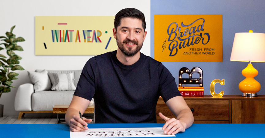
Typography Essentials for Design (Multisub)
Release date:2021
Author:Abraham Lule
Skill level:Beginner
Language:English
Exercise files:Yes
Explore the concepts and principles of typography to create inspiring designs that capture the essence of a brand.
Graphic designer Abraham Lule uses typography to put the lettering at the forefront of his logos and designs. Originally from Mexico, the NYC-based designer’s typographic designs are known for their bold colors and contrast, collaborating with prominent restaurants and labels throughout the food and restaurant industry.
In this course, Abraham teaches you how to focus attention on the typography of an illustration. Starting with basic principles of typography, learn how to blend composition, color, and lettering to create high-impact designs that capture the message behind a brand.

Explore the basic elements of good typographic composition. See how format and composition work together and analyze some of Abraham’s work to better understand the concepts.
Abraham teaches you the five elemental concepts of typographic design, covering the fundamentals of shape, space, color, hierarchy, and rhythm. Learn how to apply them to different design projects and prepare to get started on your final project.
Sketch out your message using pencil and paper. Then see how to transfer your sketches to the screen and explore a variety of digital adjustment techniques. Learn about selecting a typographic palette and see how to add custom elements and other fine details to make your work stand out.


 Channel


<3