Rediscover The Basics – Contrast
Release date:2015, January 14
Duration:00 h 10 m
Author:Dan Moran
Skill level:Beginner
Language:English
Exercise files:Yes
Thinking about how to approach the foundation of every Look
Next up in my series on rediscovering the basics is to take a look at contrast.
In my opinion contrast is the most important part of creating the look.
You can take an image to a extremely bright and zingy direction, low contrast milky direction or a natural cinematic look all with just the contrast levels.
In the insight below you’ll see my different thoughts and approaches to contrast.
We’ll take the same clip as before and try and create as many different feels as possible by just adjusting the contrast.
Here is the full versions of my two reference clips :
‘Destination’ – DubVision & Feenixpawl
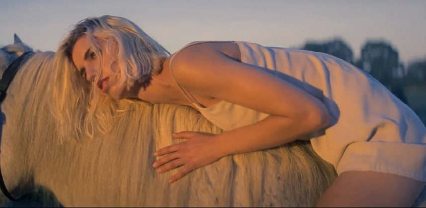
This video was shot on 35mm film and has a very natural look. I use it as a nice reference when trying to emulate film. It doesn’t have to be a heavy crazy look to feel filmic!
PHILIPS – HUE
This is a reference look for a few different contrast levels across different eras. The modern look was pushed to be nice and shiny feeling.
My Thoughts
I always start with a reference image in mind. Browse the web and find 5 different photos you like and try and match the contrast.
I find I get my best looks from the most un expected reference images!



 Channel
