

Specialization in Branding Typography – Craft Memorable Brand Identities by Ellen Lupton

Duration:12h 39m
Actual Duration:12h 39m
Release date:2025, December
Publisher:Domestika
Skill level:Beginner
Language:English
Exercise files:Yes
Software:Adobe Illustrator, Adobe Photoshop
Course URL:https://www.domestika.org/en/courses/5908-specialization-in-branding-typography-craft-memorable-brand-identities
This specialization is about making type do the heavy lifting in branding. You will go from picking the right fonts to drawing, tweaking, and building your own typographic branding, logo design, and typographic systems that hold together across a whole identity.
🎯 What you’ll learn
- How typography shapes emotion, memory, and brand perception
- How to design a memorable logotype from scratch
- How to choose and combine typefaces for brand identities
- How to customize existing fonts into unique letterforms
- How to build typographic hierarchy and cohesive systems
- How to use type, color, and texture for brand storytelling
- How to present your work in an application manual
✅ Requirements
- Skills: Basic understanding of graphic design, passion for typography and creativity
- Tools: Sketching tools, Adobe Illustrator, Adobe Photoshop
- Hardware: Computer with reliable internet connection
📝 Description
This is not a theory-only typography class. It is 6 modules, 77 lessons, and 12h 39m of hands-on brand work taught by five working practitioners. You start with inspiration — how letters carry meaning and feeling before anyone even reads the words. Then you get straight into process.
Carlos Mignot kicks off logo design from zero, showing how brand identities get built from emotion, memory, and simple shapes. Fabio Haag breaks down typeface selection and combination, plus a bit of history so you know why certain fonts feel corporate, edgy, or friendly. No guessing. You learn what to pick and why.
Then it gets practical. Daniel Barba López walks you through letterform customization — sketch, digitize, refine. Small moves: a cut here, a curve there, different spacing. That is what turns a generic font into something ownable. Ellen Lupton takes it further into visual storytelling, mixing type with color, texture, and images to give words a real voice. You finish with Carlos Mignot and Rodrigo Saiani from Estúdio Plau on bold, pop-inspired expressive type with rhythm and personality.
You will work mostly in Adobe Illustrator for vector lettering, with Adobe Photoshop for mockups and storytelling. Bring a sketchbook. Expect a lot of iteration.
🧑🎓 Who this course is for
- Graphic designers and art directors who want stronger type skills for branding work
- Branding specialists and freelancers building logotypes and identity systems
- Creatives who love letters and want to make brand communication hit harder
🧑🏫 About the Author
Ellen Lupton is a designer, writer, curator, and educator based in New York. She is known for books like Thinking with Type and her work as curator at Cooper Hewitt, Smithsonian Design Museum, plus years teaching at MICA. She is good at making complex type ideas plain and usable.
She is joined by Carlos Mignot, Fabio Haag, Daniel Barba López of Monotypo Studio, and Rodrigo Saiani of Estúdio Plau — all active in logo design and brand identity. You get different styles and workflows, not just one house look.
🏁 Final Result
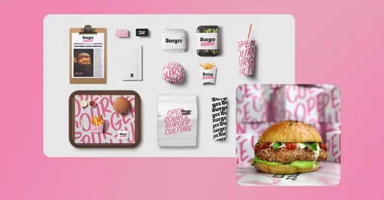
- A complete typographic brand identity: original logotype from scratch, customized letterforms, cohesive typographic system with hierarchies and combinations, visual narrative, and an application manual ready for your portfolio.
 Channel