Ad Clicks : Ad Views : Ad Clicks : Ad Views : Ad Clicks : Ad Views : Ad Clicks : Ad Views :
Oh Snap!

It looks like you're using an adblocker. Adblockers make us sad. We use ads to keep our content happy and free. If you like what we are doing please consider supporting us by whitelisting our website. You can report badly-behaved ads by clicking/tapping the nearby 'Advertisement' X text.

Masterclass In Color Grading With Derek Hansen

/

Release date:2021

Author:DEREK HANSEN

Skill level:Beginner

Language:English

Exercise files:Yes

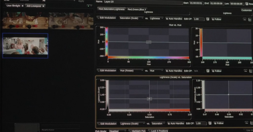
Derek Hansen is one of the most successful colorists in Los Angeles, with experience from high-end commercial work at MPC, The Mill and Arsenal Creative. In this masterclass you are invited into his color suite to watch how he creates great looking images and discuss workflow, techniques, creativity and strategies that will help you become a better colorist.

The course is about the art and craft of color grading and is not designed to teach the operations of a specific software.

Table of Contents

LESSON 01: COLOR SETUP AND ANALYZING THE SCENE
Derek is setting up the color workflow and analyzing the scene.

LESSON 02: PRIMARY BALANCE
Starting with the primary balance and discussing the importance of it.

LESSON 03: ORGANIZATION AND RIPPLING
Discussing layer organization and grade rippling.

LESSON 04: BALANCING
Balancing and discussing all the decisions to be made when it comes to brightness and exposure. Dealing with challenges such as thin images and sharp highlights.

LESSON 05: REFERENCES
Analyzing the references from the client and preparing for the look creation.

LESSON 06: CURVE MANAGEMENT
In this lesson Derek recreates some of the characteristics of Kodak Eastman, and use techniques to compress the midtones and control the highlights.

LESSON 07: DEEP SATURATION
Continuing the work of recreating the Kodak Eastman look, compressing the image with hue curves and creating deep rich saturated colors.

LESSON 08: HUE SHIFTING
Pushing and hue-shifting the individual colors to bring the colors into harmony and create a stronger look.

LESSON 09: RED TONES
Finessing the look by bringing in the red film tones.

LESSON 10: SECONDARY WORK
Finishing it all up with some shadow, highlight and skin keys to create a better match.

  • Facebook
  • Twitter
  • Google+
  • Linkedin
  • Pinterest

Leave a Comment

Your email address will not be published. Required fields are marked *