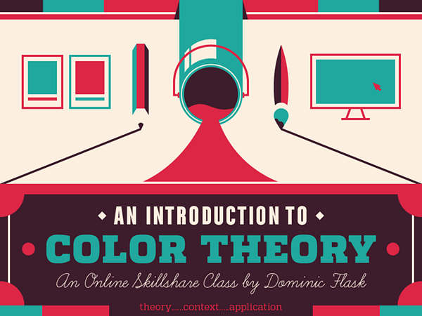
Intro to Graphic Design – Expressing Emotion with Color Theory with Dominic Flask
Release date:2019
Duration:01 h 33 m
Author:Dominic Flask
Skill level:Beginner
Language:English
Exercise files:Yes
olor is one of the most basic tools that a designer or illustrator possesses in their visual toolbox, communicating thoughts, feelings, and emotions. Correct use of color can take your project to the next level of professionalism and help your work make a much stronger connection with your audience.
Before you can become a skilled craftsman in the application of color, you must have a firm understanding of color theory. You need to know what colors exist, how they relate to each other, and how to review and discuss the use of color so you can build effective and beautiful color palettes in everything that you create.
What You’ll Learn
In this class you will learn how to build and use effective color palettes in order to convey a sense of emotion to your audience. You will use color to express a series of different emotions in order to study how color can affect perception. You will learn tips and tricks on building effective and expansive color palettes as well as ways to edit and control color in both Adobe Illustrator and Photoshop. We’ll cover:
Color Theory. We’ll start with the bare bones of color theory, talk about terminology, look at different ways of creating color, and discuss how to build a color palette.
The Context of Color. We’ll look at some of the meaning behind color and how to use color that supports what you’re trying to convey.
Expanding Your Palette. In the final section, we’ll take a look at some tips and tricks for polishing your use of color in a project, all while expanding and adding depth to your palette.
What You’ll Make
For this class you’ll create a series of images that express different emotions. You can choose which emotions you want to portray, or you can choose from a suggested list. We’ll work with a set size of 600 x 600 pixels, but the content is up to you. Want to illustrate the emotions of different flavors of popsicles? Awesome! Want to create a set of icons showing the different emotions of R2D2? Great! We’ll talk about the best way to use color in any and every scenario.


 Channel
