In Action – Working With the Key Mixer Part 2
Release date:2017, June 19
Duration:00 h 11 m
Author:Patrick Inhofer
Skill level:Advanced
Language:English
Exercise files:Yes
Part 2: Breaking Down a Difficult Shot and Using the Key Mixer
As a general rule of thumb… the more experienced at color grading I become the more I resist building complicated node trees with lots lots of ‘image segmentation’. The biggest reason: If you want natural-looking images then the best way of getting there is to let the image ‘grade up’ the way it wants to. This means don’t do lots of keys, don’t use tons of masks or shapes, don’t do lots of rotoscoping work.
But commercials are different.
Very rarely is it about letting the image look natural. It’s about making the product look as good as you can and projecting a definite (and usually, positive) ‘vibe’.
As you saw in Part 1 of this breakdown of a car commercial… the Earth’s atmosphere wasn’t cooperating with us. The distant city was naturally hazy and the sky was lifeless. We ended up with a slightly pushed, stylized look.
In Part 2 we have a new city, similar problem.
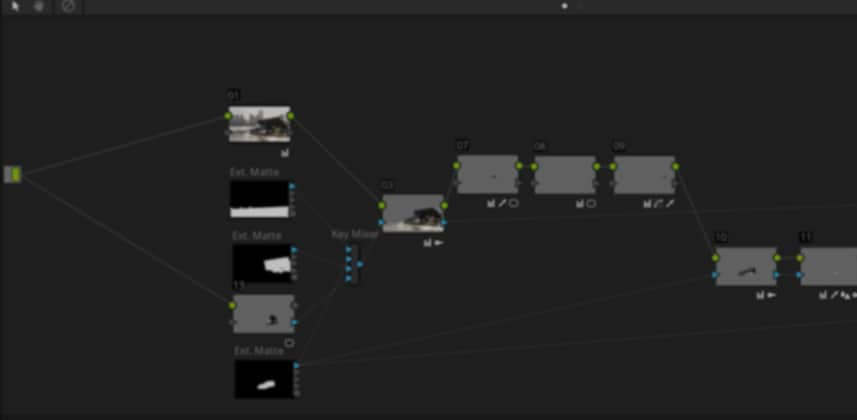
Fixing a dull background using the Key Mixer (and multiple external mattes)
On a different shot, we’ll use multiple rotoscoped elements and combine them to cut out the foreground. The purpose is to get a precise separation between foreground and background and do a completely different color correction on each – but still have them feel like a single blended image.
In the process of keying out the foreground, after combining the various mattes in the Key Mixer, we find a ‘hole’ in the matte that we have to plug. And then we need to decide how to attack the background – once the foreground node tree is built.
Comments and reactions are always welcome
At the bottom of this Insight you can leave questions, comments and reactions to start a discussion. And if your name doesn’t appear as you like it in the Comments, log in to this new page on Mixing Light to update your ‘social name’. Remember, we have a Real Names policy!


 Channel


