

")
From the Lettering to the Font (Spanish, Multisub)

Release date:2022
Skill level:Beginner
Language:Spanish
Exercise files:Not Provided
Course URL:https://www.domestika.org/en/courses/70-from-the-lettering-to-the-font
Create your own alphabet based on a found lettering
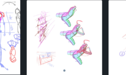
Many of the signs that we find on the street or in the advertising of yesteryear and that fascinate us are those that are well drawn, originally by hand. And it is because they underlie a coherent application of basic rules essential for design of letters and that determine their structure, appearance and the relationship between them.
In this course, with the typographers Josema Urós and Laura Meseguer (Type-Ø-Tones), you will learn to analyze “found” labels, deconstruct them and create new characters to generate your own labels, marks or even a complete alphabet.
What will you learn in this online course?
You will start discovering the work of Laura and Josema, their work environment, the tools necessary to carry out the course and how to use them.
Next, you will learn the basic principles of alphabets design using the label as one of the possible sources of inspiration for type design. In this review by the methodology of the letters you will know the flow of production, the vertical metric, the basic forms, the interior space and the optical adjustments.
Later you will make the analog sketching of your own alphabet by contour. Once you have it digitized, you will take it to Illustrator to turn it into vectorial drawing.
To finish you will learn how to draw unique or special characters, create uppercase and give the final adjustments to your final project.
What is this course’s project?
You will develop a keyword from which you can design the rest of the characters of your alphabet. Traditionally Hamburg has been used and some derivatives, Hamburgefonts, Hamburgevons and Hamburgefontsiv, but the challenge is to find yours.
Who is this online course for?
To anyone who is curious to know how typographies and graphic design students are designed to have an interest in understanding how the architecture of the letter is.
Requirements and materials
For the analog part you will need mechanical pencils, soft pencil, eraser and onion paper. For the digital part, a computer with a vector drawing software installed.
It is essential to know how to draw by hand and have knowledge of vector drawing.
01 – Who we are and course objectives
02 – Our influences examples of alphabets extracted from lettering
03 – Production flow
04 – Vertical metric
05 – Basic forms and interior space
06 – Optical systems, parts and components
07 – Sketching by contour 1
08 – Sketching by contour 2
09 – Prepare the document in Illustrator
10 – Drawing by parts
11 – Drawing the first series
12 – Drawing of the derived characters 1
13 – Drawing of the derived characters 2
14 – Drawing of unique or special characters
15 – Capital letters
16 – Fine adjustments. Space, print and correct
17 – The spacing
18 – Complete the alphabet
19 – From the Label to the Typography
From the Lettering to the Font_Subtitles.7z


Can you please add this course . Been waiting for a long time
https://www.udemy.com/course/anime-academy-tradtional-anime-drawing/