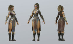
Character Design Masterclass – Design your own characters
Release date:2022, July
Author:Marius Worch
Skill level:Beginner
Language:English
Exercise files:Yes
What you’ll learn
- Shape design
- 70/30 rule
- Big/medium/small
- Repetition as a design principle
- Color effect
- photo bash
- Silhouette
- Negative space
Requirements
You don’t need any previous knowledge and can start immediately!
Wencke uses Procreate on the iPad in this course. However, you don’t need that and can take the course with any other software.
Discription
Are you looking for a course that gives you the support and expertise to design your own characters and figures?
A course that works with professional design principles and gifts you with confidence and a strong set of design skills once completed?
You’ve found us!
In this course you will learn all about the following topics: Shape language, 70/30 rule, Big/Medium/Small, Repetition as a design principle, Color effect, Photo-bash, Silhouette, , Negative space, and much more….
You’ll get instant access to:
47 hands-on lessons to follow along with (6.5 hrs of content).
All resources directly linked
Premium instructor support if you ever get stuck
Lifetime access to the course and all updates
An extensive guide to designing your character
But what will you learn in detail in this course?
Shape Design: to lay the foundation for your later expertise in character design, we’ll start with shape language. “Square, circle, triangle,…” may sound boring to you now, but it is essential for the effect of your character. Even if you already have experience in character design, it’s worth taking a look here. You will not only learn theory, but you will apply your knowledge in a task at the end.
The 70% – 30% rule: The 70/30 rule appears again and again and can be found in good artwork. After the second section you will have developed an eye for the 70/30 principle and will be able to “read” artwork with this division. You will learn how to create interest in the viewer of your painting and how to draw the eye to your work.
Big, medium, small: Feel free to check out some free preview videos at this point to see for yourself the quality of the course. With the big, medium, small principle you can divide elements of your characters into “sections” and understand how to make a character interesting.
Repetition as a design principle: In nature you will find repetitions in almost every object or figure. With repetitive elements you can create coherence and harmony. You will learn how to put this into practice in this section of the Character Design Masterclass.
Color effect: Surely you have heard something about the effect of colours, right? This plays a big role in the design of your character and is ultimately decisive for the effect. Learn colour combinations, contrasts and which character traits you can express with colors.
Photo-bash, photos as an aid: Use pictures from the internet as an aid to give your figure realism. For this you can transfer real patterns from sculptures to your character (provided you work digitally). Take a look at some free preview videos to see for yourself the quality of the course.
Silhouette: We’re almost at the end of the course, and if you’ve seen everything up to this point, you can consider yourself advanced in character design. Learn to portray the legibility, dynamics, and expression of personality of your character.
Negative Space: In this section you will learn what negative space actually is and how you can use it to make your character readable. You can use negative space to direct the viewer’s eye and put emphasis and focus on your character.
Applying the principles to an example: We have now gone through all the design principles using an example. To consolidate everything, in the last section Wencke demonstrates another character from A to Z and explains her approach in detail.
Who is Course for?
Beginners who are just starting out
Advanced students who want to learn from a real professional


 Channel


