How to choose a Color palette! by Lotus Bubble
Release date:2023
Duration:00 h 19 m
Author:Lotus Bubble
Skill level:Beginner
Language:English
Exercise files:Yes
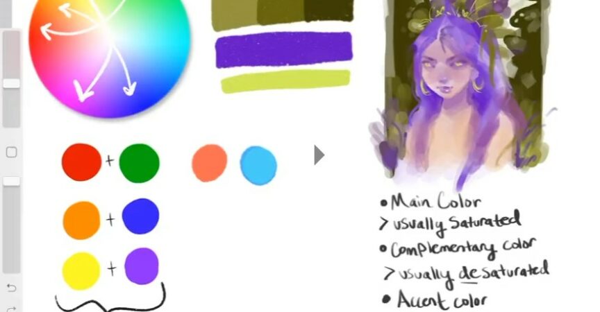
Hey everyone! In this tutorial, I’ll be sharing some tips on how to choose a color palette that works for your art.
As artists, we’ve all been in a color slump before, so I hope these tips will be helpful to you. When I’m struggling to figure out a color palette, I always start by thinking about complementary colors. Complementary colors are opposites on the color wheel, such as red and green, blue and orange, and purple and yellow.
Despite being opposites, these colors can actually work really well together. However, instead of using the exact opposite colors, we can choose shades and tones within the same color family. For example, we can choose a softer reddish-orange instead of a bright red, and a bluish-green instead of a bright green.
By doing this, we can create a cohesive color palette that looks amazing. I hope you find these tips useful!


 Channel


please upload the file (7.z) to mediafile