Foundation Patreon – Sci-Fi Design Part 3 – Redesign by Keshan Lam
Release date:2024, March
Duration:01 h 25 m
Author:Keshan Lam
Skill level:Beginner
Language:English
Exercise files:Yes
Welcome back to Part 3 of our sci-fi design tutorial! I’m Keshan Lam, your host. If you missed Part 1 and 2, I recommend checking them out for context. A little about me: I’m Kason Lam, currently a creative director at Throttle Concept Studio and an instructor at Brings Home School, teaching Warbuilding 1, Entertainment Design, Concept Art Bootcamp, and Mentorship.
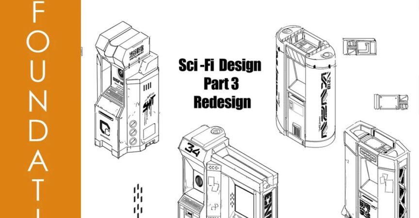
In Part 1, we covered basic flow and cut lines, while Part 2 focused on shaping. Now in Part 3, we’ll combine these techniques to redesign an ATM into a sci-fi marvel. Let’s dive in!
First, let’s visualize the typical ATM—a box with a screen and keypad. Now, let’s make it more sci-fi. We’ll apply our shaping techniques, focusing on big, medium, and small elements to create interest.
I’ll sketch in isometric for ease. Starting with the basic box shape, I’ll gradually introduce sci-fi elements like curved surfaces and asymmetry. Remember, loose sketching allows for creative exploration.
We’ll enhance the design with sci-fi decals and graphics, adding futuristic flair. I’ll use assets collected over time to speed up the process.
As we refine the design, we’ll pay attention to detail—adding texture, panel gaps, and small gadgets to enhance the sci-fi vibe.
By combining shaping techniques and adding sci-fi elements, we’ll transform the mundane ATM into a futuristic marvel. And remember, experimentation is key—don’t be afraid to try new ideas!
Thanks for tuning in! Stay tuned for more design adventures.


 Channel

