Layout and Composition- Advanced Principles
Release date:2018, March 15
Duration:01 h 17 m
Author:Sean Adams
Skill level:Intermediate
Language:English
Exercise files:Yes
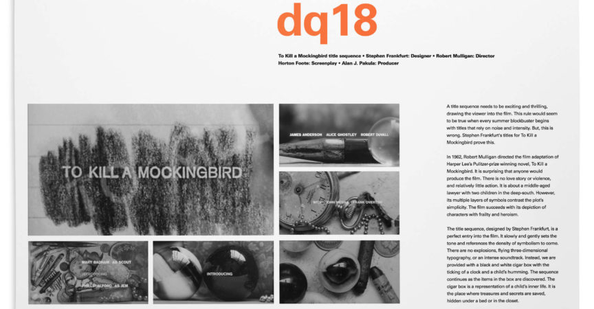
Build on what you learned in Graphic Design Foundations: Layout and Composition by taking a more advanced look at universal composition and layout principles. Instructor Sean Adams starts by teaching basic compositional elements, such as shape, color, and negative space. He then moves into advanced compositional topics, including how to use tension, scale, repetition, and hierarchy. After a look at proportion, he ends the course with a lesson on attributes. Learn about how minimalism can add interest to a composition, how to create a strong layout by cropping images and words in a somewhat unorthodox fashion, and more. Upon wrapping up this course, you’ll be equipped with techniques and concepts that can help you craft unexpected, visually intriguing design solutions.
Topics include:
Creating meaning with complex shapes
Using three-dimensional thinking
Maximizing the power of scale
How tension is created with dissimilar elements
Alternative layout processes
Minimalism and maximalism
Rhythm in sequential design


 Channel


