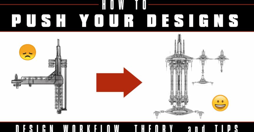
How to Push Your Designs
Release date:2021
Author:Pace Wilder
Skill level:Beginner
Language:English
Exercise files:Yes
Hello all! I decided to create my first ever tutorial for the Artstation Marketplace, as I’m a big fan of the learning community on here.
In this short video series (Approx. 40 Mins of video total) I’ll share a few design tricks I wish I’d learned sooner and sketch a little bit to apply them. Using only Photoshop, I’ll use a few workflows to help push a design a little farther.
Warning 1: Multiple times in this video, I’ll point to a picture of blueberry pie and accidentally call it apple pie. My apologies.
Warning 2: I misspelled the word “Space Station” a few times and didn’t catch it till later. Again, my humblest apologies.
Topics covered:
- Using Reference
- Sketching – The Lazy Way
- Shape Design Basics
Includes:
Narrated Video Tutorials (Approx. 40 Mins Total)
Photoshop Tool Presets (Including Brushes). Most of these I did not create, but got from free resources online.
Requirements:
I’ll only use Photoshop here, but these design principles should apply to any software or traditional art.
About me:
I’m a Concept Artist currently at DreamWorks Animation. Prior to that I’ve been a freelance concept artist on a variety of projects in games, film, and animation.


 Channel


1 Comments